Astro’s Image component
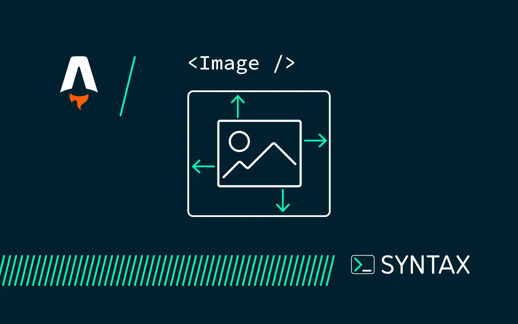
The Image component can resize, convert, and optimise both local images and authorised remote images, giving you control over how they’re displayed. For prerendered pages, these transformations happen at build time. For pages rendered on demand, the transformations occur in real time when the page is viewed. The generated <img> tag includes alt, loading, and decoding attributes, and automatically sets image dimensions to help prevent Cumulative Layout Shift (CLS).
ES6+ introduced powerful features that make JavaScript more expressive and easier to work with:
---
import { Image } from 'astro:assets';
import myImage from '@/assets/my-image.png';
---
<Image
  src={myImage}
  alt="The description for screen readers"
  loading="eager"
  width={540}
  height={240 * (heroImage.height / heroImage.width)}
  widths={[240, 540, 720]}
  sizes="(max-width: 480px) 240px, (max-width: 768px) 540px, 720px"
  class="responsive-image"
/>
Usage
If you are using the image above the fold, use eager to ensure it gets loaded quickly, but you can also use lazy it you need it lazy loaded, but its better for images below the fold.
This dimension attributes on the image component defines the sizes of an image based on the screen width. It’s a responsive image sizing technique.
If the screen width is 480px or less, the image width will be 240px – which is set here:
(max-width: 480px) 240pxIf the screen width is between 481px and 768px, the image width will be 540px – which is set here:
(max-width: 768px) 540pxIf the screen width is greater than 768px, the image width will be 720px – which is set here:
720px